Process
Below you will find details regarding my involvement in the SEL website redesign project mentioned in my portfolio. My aim of this page is to provide some insight into my process while detailing specific contributions.
Schweitzer Engineering Laboratories Website Project
The SEL website redesign project was the largest project I've worked on to date. It was naturally large due to project scope (250+ page site with nested apps), but also because it impacted many customers, prospects, and users both internal and external to the company. I learned a lot and our small core team accomplished a lot throughout the project's evolution toward launch. That said, it could not have been done without the help of various stakeholders, colleagues, testers, and customers providing valuable input and feedback.
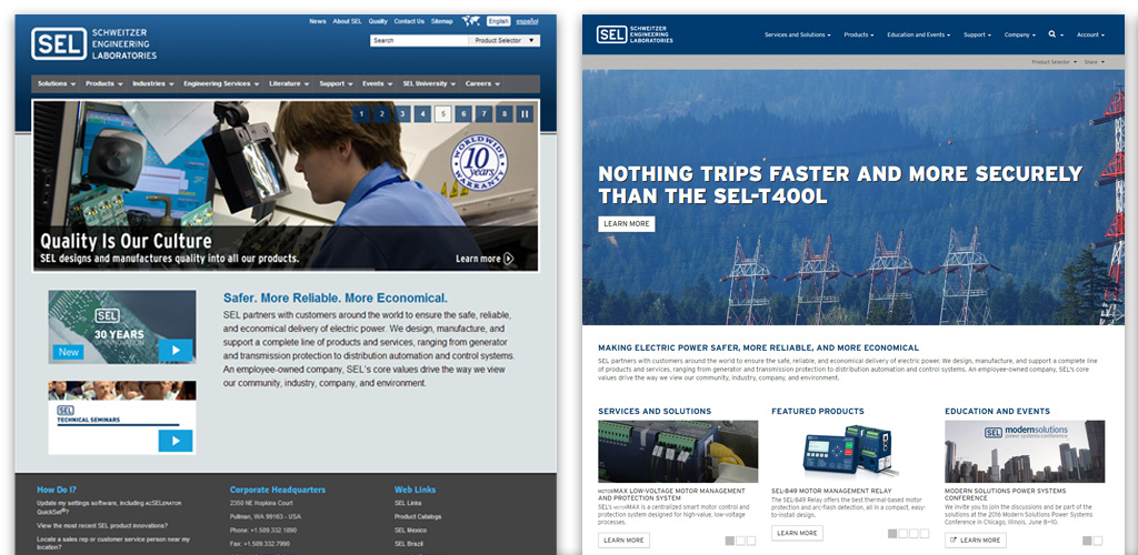
Before (2009-2015) and after (2016-Current)
Problems/Opportunities
Over time, as most things do, the website started to become dated. No one player is at blame as style and technology change in time. The site still accomplished its goals in teaching and providing functionality for customers and prospects, so why was a redesign even being considered?
At its core, the lack of mobile-friendly support and out-of-sync branding combined with the tech stack hindering future company goals overrode the argument of some to "just leave it as is". Though this latter approach would have been the much easier path, it would also do a great disservice to SEL as a whole, its projected growth, and to internal, external, and prospecting customers.
In total, the high-level problems/opportunities were:
- Not mobile-friendly
- Branding redesign left the public website out of sync
- Internationalization not accounted for in original solution
- Prior tech stack prevented expanding our desired site offerings
- Prior tech stack resulted in inefficient asset loading
- Optimizations and CDN integrations could be improved
- Lack of a web-specific style guide led to inconsistencies over time
Objective
The above high-level bullets show there was plenty of room for improvement. All of these ideas as a whole birthed as the front-end focus principles, each with their own mantra:
- Performance - "Get to content quicker"
- Consistency - "Simplify the mental model"
- Teaching - "Provide visitors additional paths to learn about SEL"
The project objective implicitly became "create a mobile-friendly, localized, performant, and consistently displayed website for teaching what SEL has to offer through existing and new means." This allowed us to keep what worked while giving us the capability to explore and validate improvement ideas.
Initial improvement explorations
Contributions - Non-Technical
Once the project was internally green lit, the race was on. Over the project's lifespan toward launch, I helped do numerous things. The first few of which were research & analysis related:
- Participated in numerous cross-discipline brainstorming sessions to gather collective input for a shared redesign solution
- Participated in competitor research to grasp relative strengths and weaknesses
- Analyzed customer feedback, surveys, and analytics to inform improvement areas
These steps were invaluable as they helped solidify assumed notions, shatter others, and provide insights previously unseen.
Information density and variety is desirable
Users crave more not less
Specific buried content is accessed a lot
Surface it
Search is misused for product part numbers
Make search smarter
Interactive hotspots occur at the template level
Redesign layout hierarchy in templates
In terms of meetings, partnering, pitches, and presentations, there was a lot of other work to be done. My boss was awesome because he nudged me when I needed to be regarding pitches and presentations. He is a great leader and he knew how to keep things positive, fun, and on track. Work here included:
- My boss, our PM, and I met with over 10+ stakeholder groups numerous times to ensure the redesign accommodated stakeholder goals
- Co-presented to the executive team for project advancement approval and feedback
- Graphic Design team collaboration to ensure brand alignment
- Video team collaboration so video was tightly integrated into templates
- Feature planning
In all, there were a lot of meetings and discussions with a lot of different people. Thankfully, the majority of them were productive as I left with notes to investigate something I didn't know or to experiment with a solution to a proposed problem that surfaced.
Contributions - Technical
There was a lot that went into the non-technical contributions from myself and the team. Ultimately however, that work simply led to and informed our technical contributions. Mine, roughly in order, were:
- Contributed to tech stack selection process
- Guided CMS process so data and display were completely separated
- Integrated the design process into our agile development process
- Fast and iterative prototyping in HTML/CSS not Photoshop
- Designed all page templates in HTML and Angular markup
- Owned all CSS organization and implementation
- Designed and developed the majority of UI modules using HTML/CSS/JS
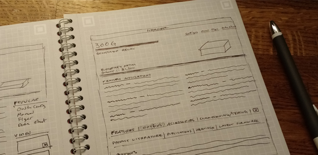
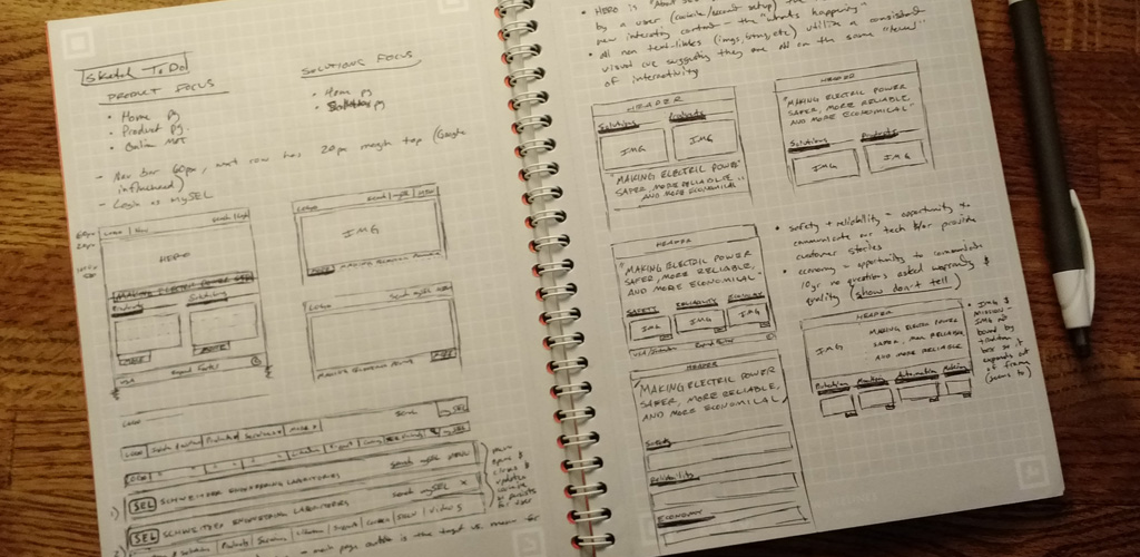
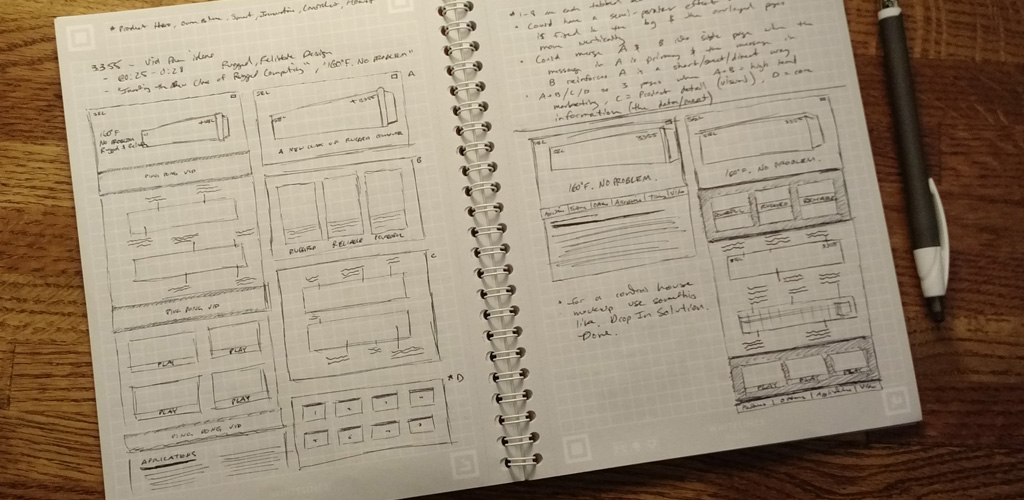
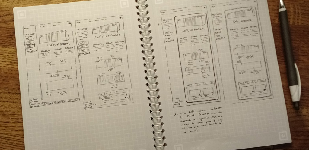
Layout design sketching
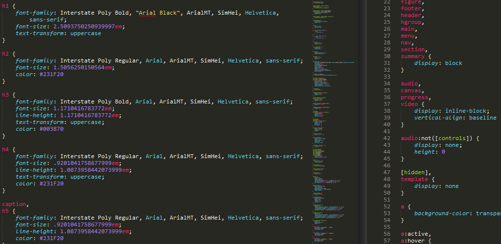
Translating branding rules to CSS
Throughout the design and development process we were very transparent and we provided a company-wide internal URL for input and feedback of our work-in-progress. User testing was insightful too, but we could have done even more of it.
Above, in the Objective section, I mentioned there were improvement ideas I wanted to investigate. I specifically had a few UI-related ones that I believed could positively impact UX while maintaining alignment with our focus principles. A few successful and unsuccessful examples follow.
Successful - Improved Product Selector Widget
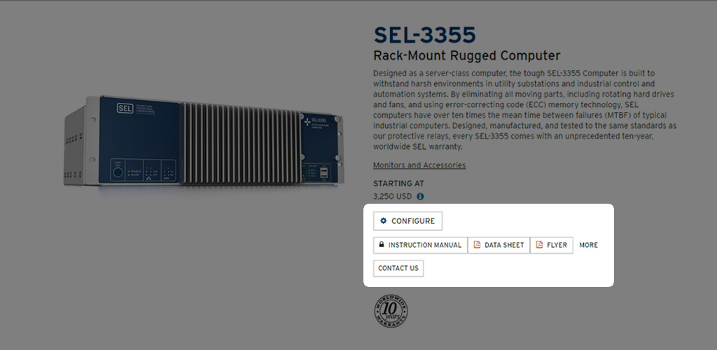
Many of the returning visitors overwhelmingly loved the Product Selector widget. I had a hunch there was an opportunity to improve the UI if I could understand why they loved it. In digging deeper I found that there was a common use case when using the widget. It led the user directly to a specific product page (saving navigation time) where the next action fell within a discreet set. Understanding this user behavior allowed me to adorn each product link with its discreet set of "quick links". A lot of users loved this improvement.
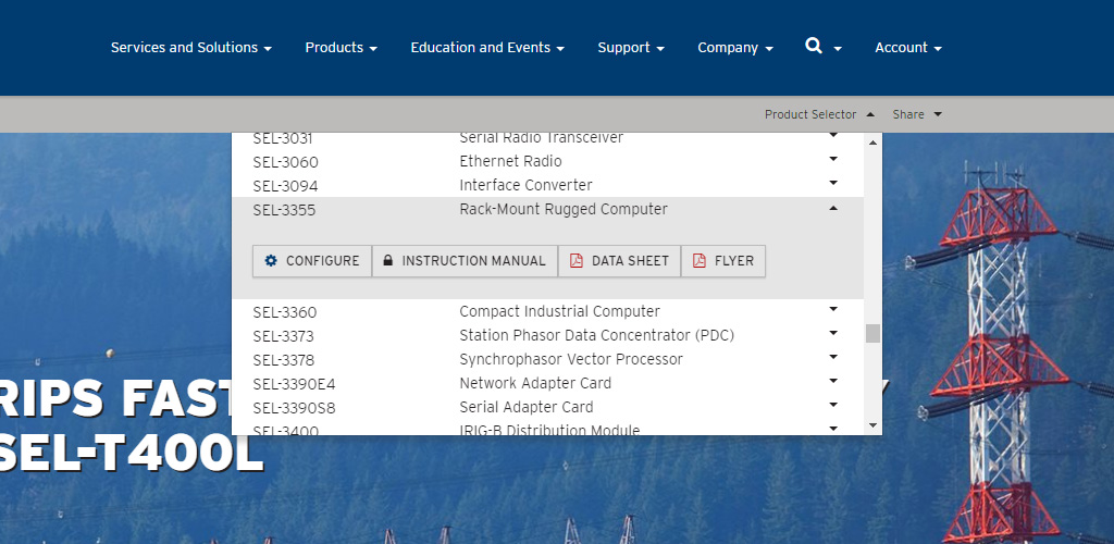
Product page link + "Quick Links"
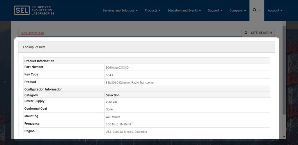
Successful - Smarter Search Widget
In analyzing site search results it became apparent that some users were searching with cryptic product part numbers. These numbers represent their unique configuration so the search engine would find no results for this cryptic string. Knowing this allowed us to improve the search widget to instead do a "product look up" so the user sees their unique configuration information as opposed to a "No Results Found" message. This is an instant win as desired results occur without changing user behavior.
Successful - Paged Menu
In an effort to empower people to get to content quicker, I designed the paged menu. This idea was inspired by the fact that we previously had landing pages with minimal content accompanied by a list of links. Why require the user to do a full page refresh just to see a new list of links? The paged menu instead enables a user to drill down (up to three levels deep) instantly without the previous penalty of the time-wasting full page refresh.
Nested navigation is instant within paged menu
Successful - Story Pages
As alluded to earlier, feedback and analytics analysis told us users want density and variety in the amount of information available. These pages are the majority. However, we believed there was still an opportunity for some pages to exist without being information dense and overwhelmingly text based. Specifically, we felt there was an opportunity to leverage more video, imagery, and animation as tools to tell stories. SEL prides itself on customer service and our customers absolutely love us for it. I wanted to design a designated space where this style of content can live so we can share these great customer service and success stories.
Providing a space to share great stories
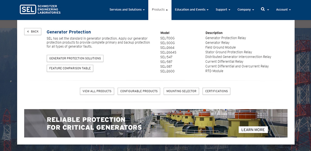
Unsuccessful - Product Certification/Technology Badges
SEL products meet and exceed various industry standards while implementing proprietary technology that is believed internally to set the standard. Of the 170+ products, customers sometimes find it difficult knowing which product is right for them. My idea was to create some kind of "short cut" system (likely in the form of iconography/badges) to create an at a glance language. This language would exist as a set of small visuals that succinctly communicated both the certifications and technologies implemented in a product. I still feel the idea carries weight, but there wasn't much buy-in on the idea.
Current product page top
Rough concept product page top
Unsuccessful - Deep Account Transparency
The main idea here was to provide more information for customers within their log-in area. The biggest hurdle here was the public website's access to customer data for display. Though this didn't hit the launch, I'd imagine this eventually will find its way into production in some form.
Unsuccessful - Pre-Search Recommendations
The initial idea here was to leverage space within the search widget panel to promote specific content. The idea gradually fizzled. Ultimately, it makes the most sense to keep the UI clean and minimal with just the search box.
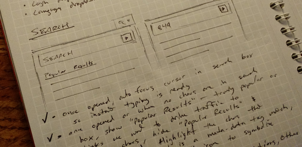
Popular results and/or funnel links
Takeaways
There are too many takeaways to count to be honest, but there are noteworthy ones for sure. This project provided a lot of learning and experience at both a high level, but also in lots of low level details. The project was on time and on budget with a slight launch delay that was out of our team's hands. This proved to be a good thing however as we were able to fine tune through additional user testing and feedback.
The project was largely a success, but with so many user types, not everyone was immediately satisfied. Post launch, there naturally was more feedback. Thankfully, only minor and simple changes were necessary. Below are some takeaway notes.
Redesigns and Returning Customers/Users
Redesigns can cause problems for returning visitors. This is something we knew and accounted for. Still, we could have done better. Below are some notes on positives, but also opportune areas:
- Strive to ensure findability is high by making analytics-determined “hot spot” UI elements maintain a similar spatial locality
- If moving UI elements of analytics-determined “hot spots” to new locations, provide clearly visible links and paths to them
- Do whatever you can to ensure site search tools are top notch to empower users
- Communicate early and often to returning visitors the redesign's benefits
Redesigns and New Prospects/Users
It is important to know past behavior, but also what desired future behavior is. Work toward understanding what this is or could be and don't stop asking questions if clear answers aren't communicated.
Gradual vs. "Flip the Switch"
If possible, provide users a transitional as opposed to an abrupt interface change. Unfortunately for us, technical limitations led to a solution of great complexity for the gradual approach.
Analytics
I can't stress enough the power of analytics. Visualized analytics data can quickly provide insight and reveal behavioral patterns. Analytics analysis informed many improvements including:
- Layout design
- Smarter search behavior
- Removal of unused pages
- Template types to focus on
- Browser technology to leverage
Team
This is obvious, but it's worth mentioning. Have a great team. If you're unlucky and don't have one, work to join one or plan a way to improve the one you're on. We were fortunate on this project as we had a great team and this led to a great end product, selinc.com.
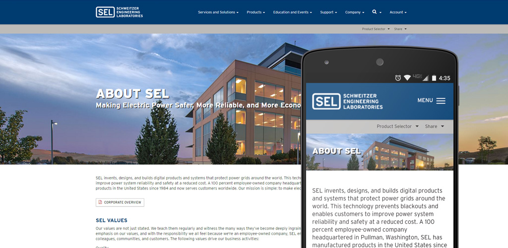
End product
If you have questions about my process in general for this and/or other projects, don't hesitate to ask. Thanks for reading.